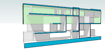
 ok so it my printed form there is no black background. And here the color scheme is yellowish. but strangely in my printed version everything thats yellow here is green. there is no substitution for the hand.
Friday, June 8, 2007
Posted by
Danielle Madsen
at
4:11 PM
2
comments
![]()
Thursday, May 31, 2007
Thursday, May 24, 2007
Monday, May 21, 2007
Sketch, Scan, Collage
 Here I tried to show light in a couple of ways. The checkerboard shadow cast on the wall, and the column highlights along with the soft shadows near the columns. Steam was also added to the nearest pool. I found that its really easy to over do it.
Posted by
Danielle Madsen
at
4:53 PM
1 comments
![]()
Sunday, May 20, 2007
Extra Credit 1
 http://www.kiky.biz/joom/index.php?option=com_content&task=view&id=36&Itemid=50
This tutorial was really easy and I think that the smoky water for the Hot tub effect turned out alright. The rest of the project is still under construction!
Posted by
Danielle Madsen
at
3:54 PM
0
comments
![]()
Thursday, May 10, 2007

 Overall I am happy with the turn out of the midterm, I would probably change a few things with the way the print turned out but I think i captured the ideas that were suppose to be grasped. I was a little confused as to what we were suppose to convey with the diagrams.
Posted by
Danielle Madsen
at
7:44 AM
1 comments
![]()
Sunday, April 29, 2007
Possible Immersive
 Heres an option for my other Immersive. i tried to watch for a foreground middle ground and background
Posted by
Danielle Madsen
at
4:14 PM
0
comments
![]()
Saturday, April 28, 2007
Section Perspective

This is what i interpreted the assignment asking for. If i am off whoever looks at this leave me a comment so i know to look over it again. thanks.
Posted by
Danielle Madsen
at
7:44 PM
1 comments
![]()
Thursday, April 26, 2007
Entourage (3)
The phone booth was the most difficult because when I changed the contrast it looked like a big blob. Thats why I decided to show a little bit of pigment instead. Wild Card "Phone Booth"
 Landscape "Joshua Tree"
 Alicia Izak "the stance"
Posted by
Danielle Madsen
at
6:02 PM
0
comments
![]()
Sunday, April 22, 2007
Assignment 3
 Section Perspective Illustrator
Posted by
Danielle Madsen
at
10:11 PM
0
comments
![]()
Sunday, April 15, 2007
Sunday, April 8, 2007
Additive Interior 2
For all the posts I tried to pick views that would be easy to understand, and views that had interesting shadows that made the composition more exciting, The focus of each was either a void in the center of the shot or a plane of interest to me. I think that had i changed the lens focus i may have been more successful. The additive approach was easier for me because i did the subtractive approach first and had to try to figure out the bugs in the system. I think that i was successful at implying a cube, but if i could improve on one thing i would take more advantage of the camera options
Posted by
Danielle Madsen
at
7:23 PM
0
comments
![]()


